UX, meaning and singular focus
The least exciting part of video games is typing something with your keyboard, but the way in which it's done is novel—compared to most programs. (I have a corollary about the web here, but bear with me.) 🐨🔜🕸️
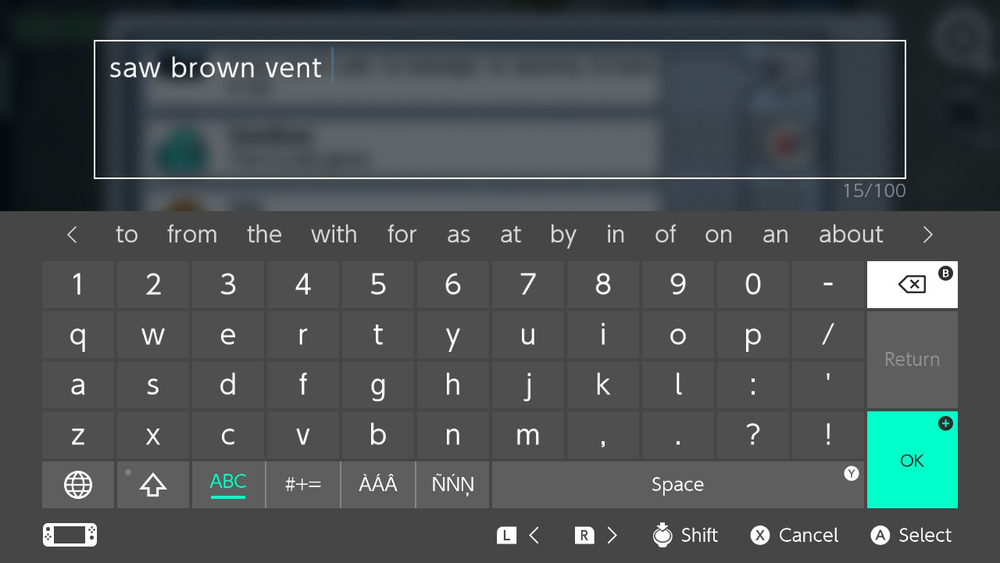
When you're using a console—whether it be from Sony, Nintendo, or whatever—entering text is a unique experience. It happens rarely enough that each platform yeets 👴 you out of the experience and overlays a full-screen dialog to let you type.

While it's obviously a requirement to show a virtual keyboard or other input mechanism (you can use keyboards on consoles, although it's rare), we see that on mobile devices when entering text too. The modal here is the most unique part—I'm able to prepare my answer before finalizing it and returning the result to the game.
What would this look like on the web? Have a turn:
Try submitting the form without data, and try again with dummy data. You can also imagine rendering a smaller version next to the request for data, showing what the user entered.
User input
This post is really about forms and accepting user input.
Isn't it a pain?
Who looks at a humble <form> and <input> elements and says—yes, this is exciting?
There's two big misalignments re: entering user input I would identify with web (or application) development. 👎
-
We only have a single notion of focus or current activity—I can't type two things at once
Consoles present a solution here: our game presumably just calls some API that says "I'd like to accept a string from the user, thanks", and doesn't have to worry about its equivalent to
:focusor the state of<input>elements. -
User input ends up being imperative, not declarative
Yes, all comments about "HTML isn't a programming language" aside, a huge amount of our work when accepting user input is attempting to present a declarative concept ("I want your address", "please order these photos to your liking") in an imperative programming environment.
We do this huge dance to present elements, attempt to explain what they are (through labels, placeholders,
type="tel"and so on), not to mention move the user's focus there, and then (presumably) doing things like validate the input, sending it to a server, and so on.
To be clear, the humble <form>—in its simplest form, asking for several fields with a submit button—in a way, can be considered declarative in terms of its code.
You don't need any JS to run it, it'll happily validate itself with rules defined in attributes, and send its results off to another page.
And in one of the great conviences of the modern web, the right attributes—like type or autocomplete—will actually prefill data for you.
Giving out your personal details has never been easier.
But we don't just want the simplest form for complex applications (or games!), full of JS and interesting states of being.
An aside on content
If as developers we only cared about content, we'd just serve a <main> tag which itself only contained <p> or <ul> and friends, multimedia, links to other pages, and so on.
This is purely declarative experience, and you'd let users subscribe to it via RSS. 🔥
(Remember that "reader mode" in your favourite browser is basically trying to do emulate this and move aside all the cruft around the actual important part of your site so it can render just that.)
Of course, sites are't just content, and while I mention this pure, declarative idea of content only, it's not really what the web is for today. It's for whole applications—I'm even typing this in a web browser, one that powers VSCode—or even just a comment or voting form.
In the end, we're all just trying to convince the user that "this box" contains some navigation area, "that circle" represents a button the user can tap to change a state, or "this div" is actually a giant modal.
Semantic elements or role="..." attributes are important, especially for disadvantaged users, but for most of us—we're just trying to make sense of what our eyes are looking at.
User input & payments
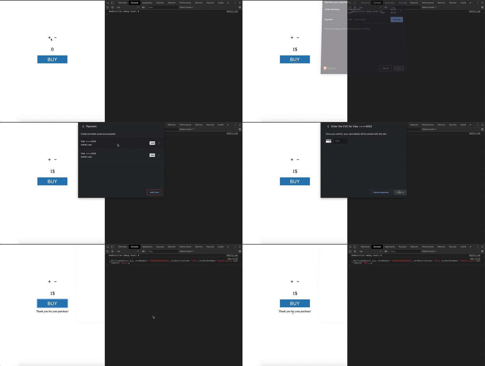
When I buy a burger from my local vegan hipster burger joint, I have my payment details sent by the browser itself, without a form or <input>—there's no awkward conversion to text and back, trying to fit neatly into a "MM/YY" expiry field.
The Payment Request API is happily suppored by Safari and Chromium-based browsers.

This lets us as developers ask for something which is fairly stable, and can even be updated by the user outside the webpage before submitting—why reinvent the wheel for credit card storage?—it's all provided for you.
To be clear, this API isn't actually more secure than entering your credit card directly. It still hands off the number in a JS callback to the website, allowing it to process your card details as sees fit—and turns out, that website could still be malicious.
So why is this API available at all? 🤔
To be cynical, removing barriers to payments makes it easier for you to spend. But it's also just awkward entering these numbers all the time, and this removes the friction between a user and you as the developer of some site that wants this data.
And a lot of APIs we consider upcoming fall into this category. There's the Contact Picker API, which short-circuits having to enter phone numbers or addresses into a site. (As an aside, I'm a bit surprised this API doesn't have an option for "get my contact", because it seems like a common use-case, rather than having to search through a list to find my own contact every time.)
And I'll also mention inputs like <input type="date"> or time, as these are already better primitives that have come after years of struggle.
In practice, this means I no longer have to manually ask for date, month, year, plus deal with the idiotic American date format.
(And despite their usefulness they have even less browser support than insanely complex features like Shadow DOM.)
While this is purely hypothetical, could the Payment Request API have instead been <input type="cc">, which somehow wraps up card number, CCV, and expiry—rather than imperatively (as in JS) mysteriously handing the result back to the underlying site?
Encapsulation to the rescue (?)
We don't always have APIs like we do for payments though.
And so, today, building complex applications and even trivially interactive websites still involves adding <input type="text">, radio buttons, checkboxes, drag an drop UIs, or the humble <div> masquerading via role attributes (I hope, anyway).
And we tend to use componentize (which I suggest is the more specific form of encapsultion as it applies to sofware development) to build and maintain complex UIs like this.
That can be with Web Components, React, or just with BEM.
(The <input type="date"> example above, in many ways, is a simple form of this: the browser wraps up three smaller inputs and presents it as one.)
Here's some examples of inputs that could be componentized, from less complex to more:
-
asking the user to accept cookies—you might have a widget that is quickly and rapidly dismissed by your users
-
accepting a user's address—providing a single component which includes fields like state, and either a free-form or dropdown to select country
-
ranking items from best to worst—this could ideally be a drag and drop UI, or allow reordering via keyboard, or even simple number fields next to each item
-
selecting which images contain traffic lights—like them or not, CAPTCHAs exist and they tend to be generated/included via a single component
-
entering rich full text—the humble
contentEditableattribute has caused many developers incredible pain
This is all well and good, and I sincerely hope that your framework of choice (or your DIY code) encapsulates these behaviors in reusable components.
But… as I've been suggesting, these component tend to reinvent the wheel, and themselves have to express themselves a large number of elements or nodes that are individually focusable and have complex state. They must all exist on your page at once, and all handle the possibility of being focused, unfocused, tabbed through, or moused over.
You might also have to contend with issues generally around the CSS box model—think properties like z-index, overflow, and position: fixed: where is your component and how much power does it have to render itself?
Are you able to show a informational popup, or include a modal?
Componentizing on the web can work really well until you hit one of these roadblocks—then it's back to a <div> temporarily added to the <body> element, z-index: 999999999, and other mountains of hacks.
On mobile 📱 or small screens, this is even worse, as you have to contend with a pitiable amount of screen space to work with. Trying to manually type in an address and have the browser's autocomplete plus the site's helpful built-in autocomplete compete for your limited attention is an experience no-one likes.
Some suggestions
There's an extreme suggestion here. Could you as a developer request this data from the browser, or for the user to enter it—just as we saw in the payments example? Sure, but that's just wishful thinking at this point, would take years to implement by browsers vendors, and we'd always be asking for the next missing primitive.
This brings us back to my original demo.
Forms, to me, are made up of various componentized inputs which represent various concepts. Just from the list above, we have address inputs, ranking items, and… the point here is not to have an exhaustive list, that isn't possible—we as web developers are the creative ones.
By creating a single top-level concept of data-entry (that appears when I ask for a compound input, like an address), we:
- separate out the idea of entry from processing, so our application can respond to the full user input once it's ready
- not have to present every component at once (even though only one can actually be focused!)
- take advantage of being a singleton, not a componentized thing, and just avoid dealing with the CSS box model's weirdness

And data entry can be fun, too. 👨🎤
I wouldn't consider myself a UX resarcher. I think there'll always be a place for inline input, or responding on every keystroke—think type to search. But I hope this has been an interesting thought experiment for you.
Let me know what you think on Twitter.