How to add a Web App Manifest and mobile-proof your site
It's the year 20xx, and everyone has a phone—statistically an Android phone, if it's a smartphone. Most importantly, it's the primary and only internet device for the average person. 📳⚠️
∴ your site deserves to work well on mobile.
This article just covers the technical steps 🛠️ for making your site work well on mobile these days. Let's go!
0. Specify a viewport meta tag
If your site has literally never been mobile-optimized, chances are that opening it will give you a horrible experience involving panning and zooming.
Add a meta tag.
Go, now, look it up somewhere else.
1. Add a Web App Manifest to your site
This is a JSON file ⚙️ which describes how your site is turned into an "application" on a user's home screen or in their application list.
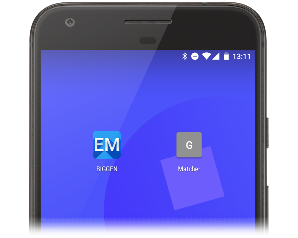
In 2016, about 10% of all eligible sessions (users on Android devices) of Santa Tracker 🎅🎄 began via the home screen icon. So it's worth doing.
{
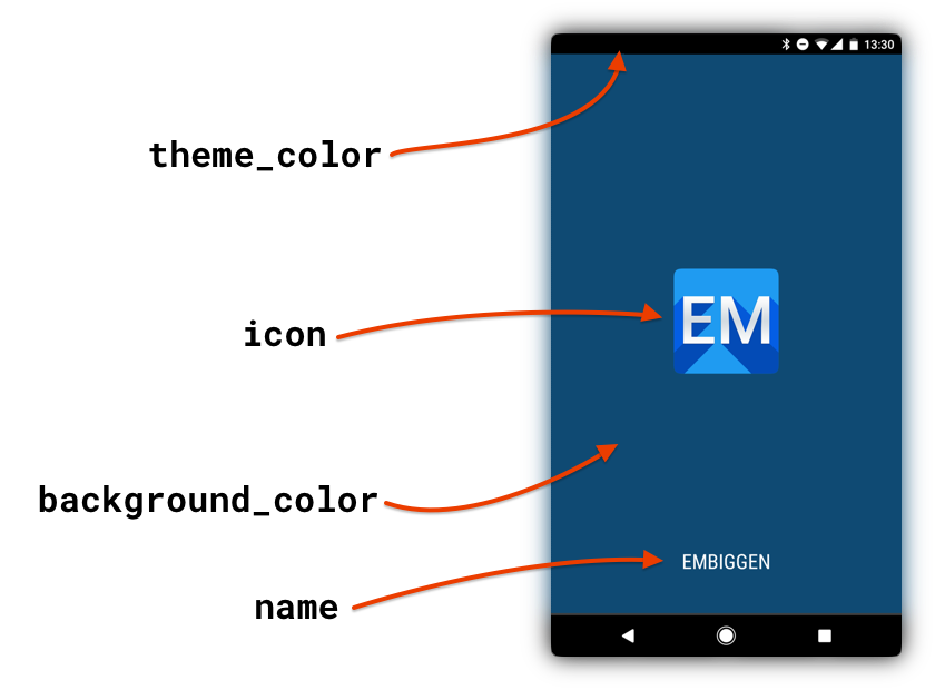
"name": "Your Great Site",
"short_name": "Site 😎",
"description": "Learn how to create and share something or other.",
"start_url": "/?homescreen=1",
"background_color": "#000000",
"theme_color": "#0f4a73",
"icons": [{
"src": "icon-256.png",
"sizes": "256x256",
"type": "image/png"
}]
}
-
Copy some existing JSON and modify it, e.g., the code just above
-
Give your site a name and a short name (used under the icon)
-
Specify icons, including one of at least 256x256 pixels
-
(optional) Set a
background_colorandtheme_colorthat show while your site is loading -
Finally, save the file and add it to your page's
<head>via tag:
<head>
  <!-- other headers -->
  <link rel="manifest" href="manifest.json" />
</head>
That's it. You're done. You can even validate your site with an online tool, but mostly you should celebrate with a donut. 🍩
2. Set a theme color
In Chrome for Android and a small list of other browsers, your website can configure the toolbar color. If you leave this out, it will be default black.

This is even simpler than it looks. Android will actually dim 🔅 the color you give it: so you can literally specify the primary background color of your site, and even if that abuts 🍑 the toolbar, the color will look different.
Specify it inside <head> via tag:
<head>
  <!-- other headers -->
  <meta name="theme-color" content="red" />
</head>
If you're feeling motivated, you can even change this at runtime, maybe to get your user's attention with a visual aid. 🚨
3. Traditional icons
Your site might already have a favicon—the cute icon you see next to a tab's title, or as part of a bookmark—since there's nothing specifically mobile about it.
However, here's a refresher with two options:
3a. Write them manually
You can describe a number of icons inside <head>, like this:
<head>
  <link rel="icon" href="icon-256.png" sizes="256x256" />
  <link rel="icon" href="icon-128.png" sizes="128x128" />
  <link rel="icon" href="icon-64.png" sizes="64x64" />
</head>
This is fine, but just a pain 😩. You can probably get away with just specifying a couple of small ones—128x128 and lower—since they're just for that tab icon. Your user's browsers will pick the best size.
It can also be good to include a hand-crafted 16x16 and 32x32 icon for older browsers on low-DPI screens. You can express a lot more in crisp pixel art than you can by just resizing a high-quality, alpha, gradient 256x256 icon at a tiny size.
3b. Use a helper library
Google has released a drop-in library called pwacompat that will actively read your site's Web App Manifest and generate the required icons. You should still follow the above advice—include a variety of icons, including small, crisp options—but you can just specify them in your manifest.
It's simple. Just drop this in after your manifest:
<link rel="manifest" href="manifest.webmanifest" />
<script async src="https://unpkg.com/pwacompat" crossorigin="anonymous"></script>
You'll probably also want to add at least one icon manually (I suggest 128x128), as this is often used by search engines or other external tools.

I am biased—I'm the primary author of this helper. However, I use this on every site I build, as I can forget everything to do with icons and just drop in one script tag. Done! 🎉
What are my next steps?
You've added a Web App Manifest, so if users install your app to their home screen, they get a great experience. But you can also leverage this to actually prompt users to do this automagically!
If you serve on HTTPS, and have a manifest plus a Service Worker, browsers will show this prompt after some magic level of engagement is detected.
What's a Service Worker? It's complicated. It helps you cache your website offline. But- we're going to ignore all of that. Inside a script tag, add:
if ('serviceWorker' in navigator) {
  // sw.js can literally be empty, but must exist
  navigator.serviceWorker.register('/sw.js');
}
This registers a Service Worker (at /sw.js), which can just contain the single line:
self.addEventListener('fetch', (event) => {});
Congrats! You've entered the modern, mobile-friendly web world. (If you'd like to build a Service Worker that actually caches your website offline, be sure to check out Google's introduction).
Originally posted on Medium.